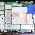
If you do board-level repair, you know that a motherboard stuck in an infinite power cycle is one of the hardest puzzles to solve. Recently, I had a Dell Inspiron 14 N4050 on my bench with exactly this issue.
This laptop features the Wistron “Enrico Caruso 14” motherboard and is from the Intel Sandy Bridge (2nd Generation) era, originally released around 2011.
Because I didn’t have time to finish the repair in one sitting, I am writing this article as a log of everything I have done so far to remind my future self and maybe help anyone else facing a similar issue on this board.
The Symptoms and Early Checks
The behaviour of the board was strange. If I turned it on without the DDR3 memory installed, it would stay powered on and give the standard Dell 2-beep alarm indicating missing RAM. But the moment I installed a known-good stick of RAM, the board would turn on for just a few seconds, completely shut down, and then loop this cycle forever.
Before diving deep into the circuits, I did the standard preliminary steps:
- I completely removed the motherboard from the laptop chassis.
- I disconnected every single peripheral: USB boards, the WLAN card, the SSD/HDD, and the optical drive. The issue remained.
- I suspected a shorted secondary power supply might be pulling the system down under load. I took my multimeter and measured the resistance to ground on every single power coil. Everything was good. There were no dead shorts.
Flashing the BIOS
During my diagnostic process, I wanted to be completely sure that we do not have a frozen/corrupted BIOS firmware. Since I use Linux as my primary operating system, flashing a raw BIOS file onto a dead motherboard required a few extra steps and some command-line work.
Extracting the .rom Payload using Wine
The first hurdle is that Dell only provides BIOS updates as Windows executable (.exe) files. You cannot simply flash an .exe directly to a chip. I needed the raw .rom binary payload hidden inside that installer.
To do this on Linux, I used Wine (the Windows “emulator”). For many Dell BIOS updaters, you can extract the ROM by running the executable through Wine via the terminal and passing a specific extraction parameter.
I opened my terminal and ran a command: wine N4050A08.EXE /writeromfile This successfully spit out the clean, raw .rom file I needed for the motherboard.
Desoldering the SPI ROM Chip
Because the motherboard was stuck in a boot loop, I could not update the BIOS via software. I had to program the chip directly.
I located the W25Q32BV chip on the motherboard (an 8-pin SOIC Winbond chip). I applied a good amount of flux, set the hot air rework station to around 380°C, and carefully heated the pins until the solder liquefied. Using tweezers, I lifted the chip off the motherboard.
Programming with Flashrom
With the chip off the board, I placed it into a USB hardware programmer (I used the CH341A programmer) and plugged it into my USB.
To write the extracted file to the chip, I used flashrom, a powerful open-source utility for reading and writing flash chips.
First, I used Flashrom to detect the chip and back up the corrupted firmware just in case: flashrom -p ch341a_spi -r n4050a08_backup.rom
Once the backup was safe, I erased the chip and wrote the fresh Dell .rom file I had extracted with Wine: flashrom -p ch341a_spi -w n4050a08.rom
Flashrom outputted a “VERIFIED” message, confirming the new code was perfectly written to the silicon. I applied fresh solder paste to the motherboard pads, used the hot air station to solder the chip back into place, and cleaned the area with isopropyl alcohol.
While this fresh BIOS eliminated firmware corruption from my list of suspects, the power cycle loop continued, pushing me deeper into the hardware diagnosis.
Diagnostic Tools
To tackle this, a simple multimeter wasn’t enough. Here is the gear I used during this diagnostic session:
- Digital Multimeter
- Oscilloscope: Hantek DSO-6022BE (USB scope using OpenHantek software)
- Bench Power Supply
- Hot Air Rework Station & Soldering Iron
- Mini-PCIe Diagnostic POST Card (modified, as I will explain later)
- Schematics & Board-view Files: Crucial for tracking traces. (Here you can download the schematic and board-view I used)
VTT Memory Power
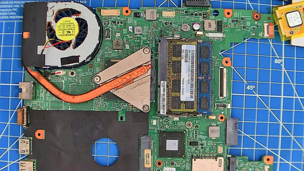
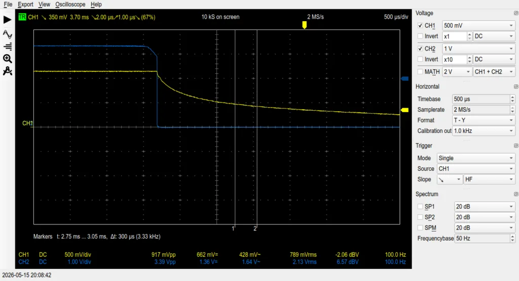
Since the crash only happened when the RAM was installed, I focused on the memory power circuit. Using the oscilloscope, I checked the DDR3 Termination Voltage line (0D75V_S0). DDR3 requires a VTT rail that is exactly 50% of the main 1.5V rail, so it should be a solid 0.75V.
My initial readings with the RAM installed showed something wrong: the voltage was collapsing to 0.55V and vibrating with almost 1V peak-to-peak (1.04Vpp) of AC noise! The memory controller IC (a TPS51216) was oscillating out of control.
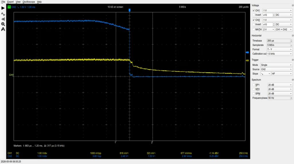
I removed the VTT filter capacitors (PC4615 – 100nF and PC4616 – 10uF) and tested them out of circuit. They were perfectly fine. I soldered them back onto the board, and magically, the rail stabilised at a perfect 0.76V with only 80mV of ripple. The massive noise was caused by a fractured or “cold” solder joint under those capacitors!
Verifying the CPU Health
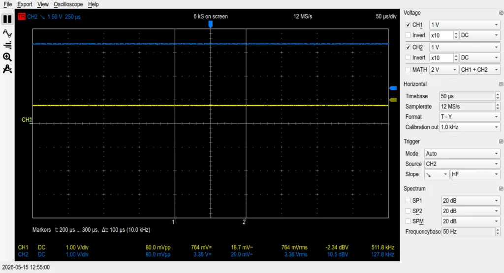
Even with perfect memory power, the board still power-cycled. I needed to know if the CPU was actually trying to boot.
I probed the CPU VCore and the Power Good (PROCPWRGD / H_CPUPWRGD) signals. The capture was perfect: VCore ramped smoothly from 700mV to 1.2V, and the Power Good signal jumped cleanly to 3.3V.
Furthermore, probing the SPI BIOS chip (SPI_CS and SPI_SO) showed bursts of data. The CPU was alive, fetching firmware, and executing code. Finally, I probed SM_DRAMRST# (Pin 30 on the RAM slot). It spiked to 1.5V right before the crash, proving the CPU’s internal memory controller had successfully initialised and was sending the command to wake the RAM.
What is the LPC Interface?
To find out exactly why the CPU was aborting the boot, I needed to read its mind. This is done by reading the BIOS POST Codes.
Every time the CPU finishes a step in the boot process, it broadcasts a 2-digit hex code over the LPC (Low Pin Count) interface. The LPC bus is a 33MHz digital communication bus used by Intel processors to talk to slow legacy devices (like the Nuvoton keyboard controller). If you hook a tool to this bus, the very last code broadcast before the board crashes tells you exactly where the sequence failed.
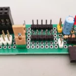
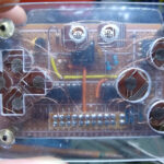
Hacking the Debug Card
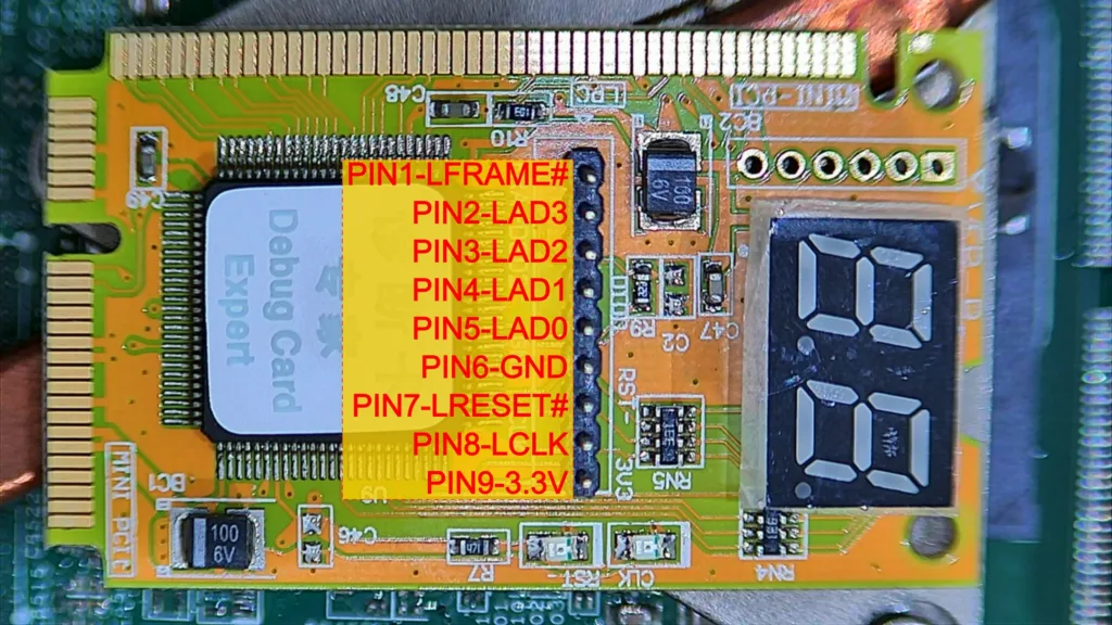
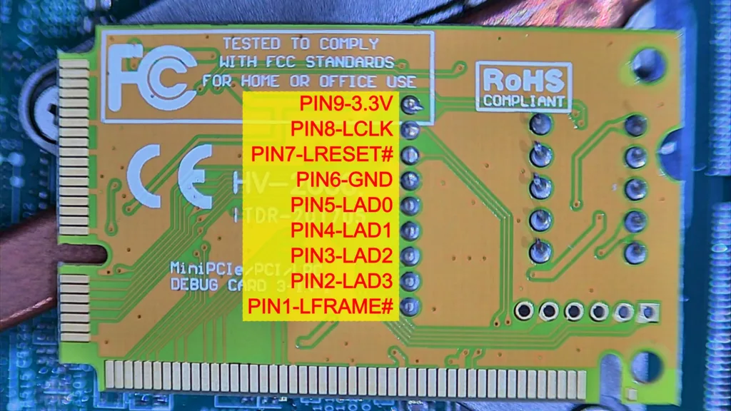
I had a standard laptop diagnostic card with a Mini-PCIe interface. I plugged it into the Wi-Fi slot, but it only displayed “0”.
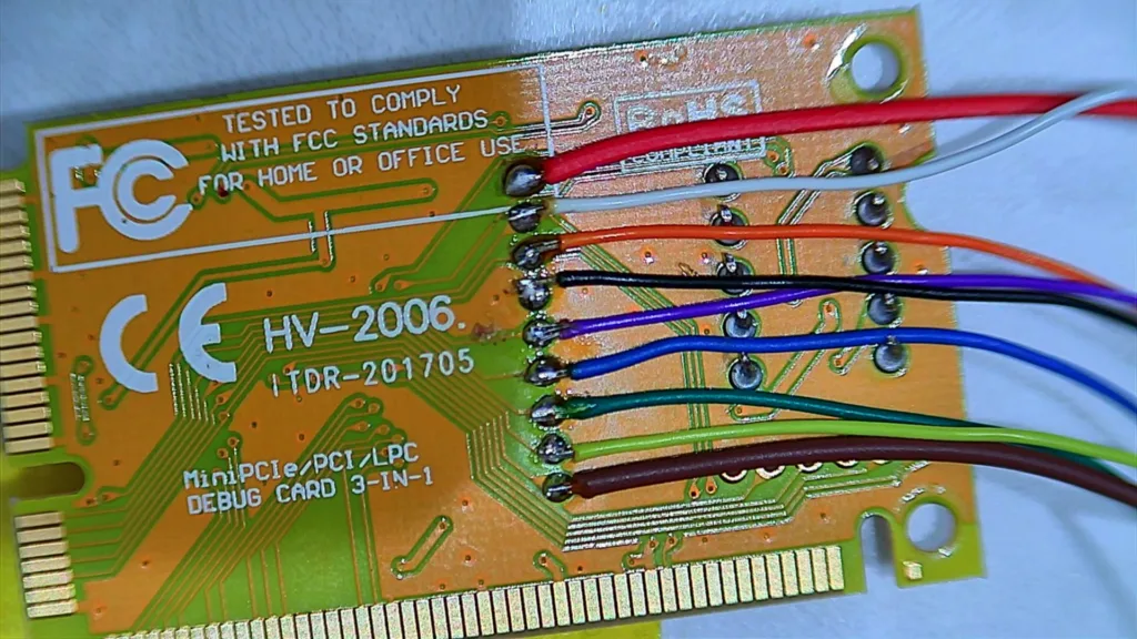
After scratching my head for some time, I searched the internet and found that many people get tricked by this. The PCI-E debug card cannot be used in all laptop brands and models. Only some brands use the “unused” PCI-E pins to show POST codes. Wistron motherboards do not route the LPC bus to the Wi-Fi slot. To get the codes, I had to hack the card. I soldered wires directly from the debug card’s chip to the LPC bus on the motherboard.
The DB1 Header
Looking at the schematics, I found a debug connector on the board named DB1. I carefully soldered wires from the pads on my debug card directly to the DB1 header on the motherboard. I turned the power on, expecting to see the codes, but the card still showed a dead “0”.
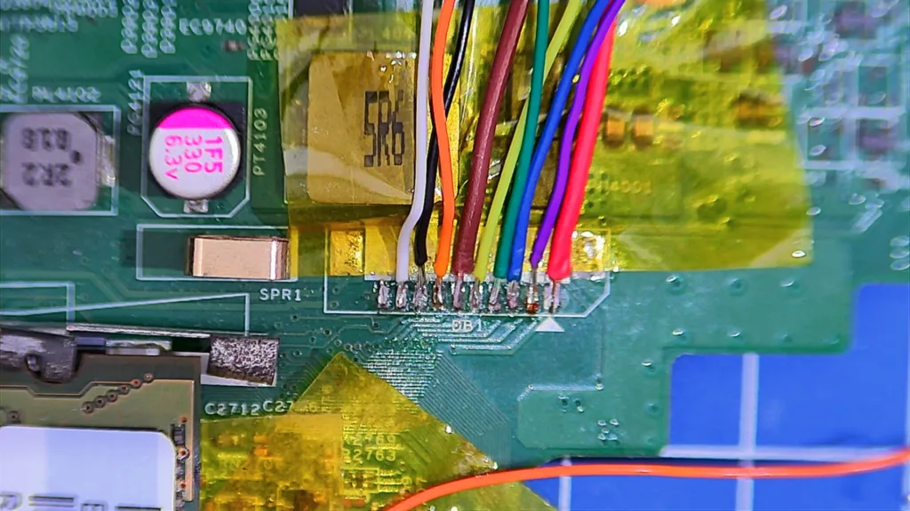
I guessed (right, as I’ll explain later) that some signal was missing at the DB1 connector.
I had to find another place to hook my wires into the LPC bus. I studied the board-view file and located some alternative bare test points on the motherboard that connected to the Nuvoton Embedded Controller. I grabbed my soldering iron and attached wires to these test points.
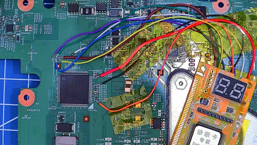
After doing all this soldering, I turned the power on, expecting to see the codes, but the card still showed a dead “0”.
At this point, I took the oscilloscope to check the signals and discovered a frustrating factory trap. Dell actually disabled the LPC clock pin (CLK_PCI_DEBUG) for that specific header before shipping the laptops. Without that 33MHz clock signal, the debug card chip is completely blind.
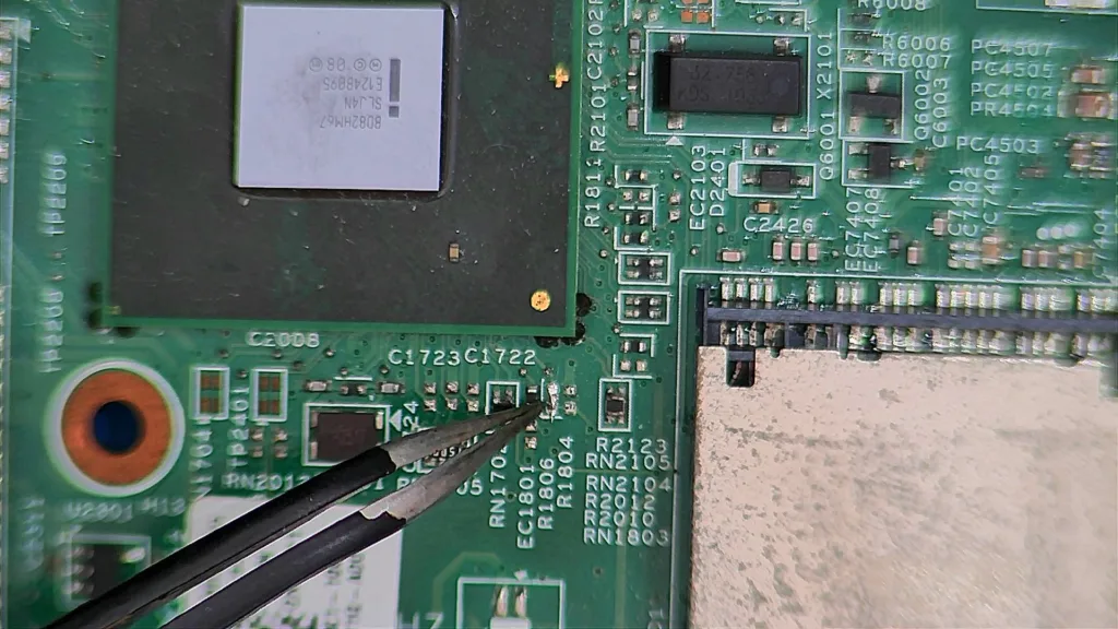
To get the clock running, I had to solder jump the resistor R1806, near the PCH.
Ripped Pads
Here, I made a terrible mistake: the wires I used to hook the debug card were way too thick and rigid.
While I was moving the motherboard and the debug card around on my bench to get a better look, the rigid wires pulled hard against the PCB. The tension was too much for the delicate traces, and it ripped the copper test points completely off the motherboard, even though I used Kapton tape to prevent the wires from moving.
Next time, I’ll use the DB1 connector again to listen to the LPC bus.
The Plot Twist: Code 62
With the debug card wired up and running well, I turned on the board. The numbers flew by on the display, and right before the system crashed, it stopped on exactly one code: 62.
According to a quick research I made, the InsydeH2O EFI code 62 stands for: “Installation of the Southbridge (PCH) Runtime Services.” This changed everything. It meant the memory training was 100% successful. The CPU had read the RAM, unpacked the code, and moved to the next phase. I guess the crash was happening because the Intel PCH was trying to wake up a secondary peripheral, and that peripheral was fatally failing.
The Ethernet Module
I immediately suspected the Realtek Gigabit Ethernet chip. I used my bench power supply to inject 3V into the 3.3V line feeding the Ethernet circuit. It only drew a normal 120mA, and nothing got hot, meaning there was no direct electrical short to ground.
However, when powering the board and measuring, the oscilloscope showed that the exact millisecond the 3.3V Ethernet power gate opened, the system’s power_good signal dropped to zero.
I thought I had found the killer. I decided to remove the MOSFET (Q3103) to cut all power to the Ethernet module, effectively making it invisible to the PCH.
The result? The board still power cycled exactly at Code 62.
In other words, the Ethernet module was innocent. The power drop on the oscilloscope was just the PCH intentionally killing the system power because another component waking up at the exact same time was failing.
Next Steps (Where I Left Off)
Because I ran out of time, I had to put the motherboard on the shelf without a diagnosis.
Since the Ethernet is ruled out, but the Code 62 crash remains, the PCH is failing to initialise a different peripheral. When I get back to the workbench, these are my exact next steps:
- Test the Audio Codec (IDT/Realtek): The audio chip wakes up at the exact same time as the LAN. I need to find the power jumper or ferrite bead feeding the audio IC, remove it to cut its power, and see if the board sails past Code 62.
- Test the Card Reader IC: Similar to the Audio and LAN chips, this is a PCIe/USB device that initialises during this phase. I will isolate the power line next.
- USB Test: I will use my multimeter in Diode Mode to check the D+ and D- pins on every USB port. If any of them read 0.000V to ground, it means the PCH silicon itself is internally destroyed, I guess.
I’ll get back to you with an update once I’ve had a chance to complete these final isolation steps and, hopefully, revive this laptop.
See you!