
Stay awhile and listen… Java Swing is a robust framework for creating cross-platform graphical user interfaces (GUIs). While it provides a native look and feel across different platforms, there are times when you might want to customize the appearance of your Swing application to match your brand or achieve a particular aesthetic. This is where theming Java swing applications comes into play. I will show how I themed a particular Java Swing application to give it a unique and personalized look.
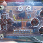
The application I worked on I made back in 2002, maybe, when I was learning Java by myself and guess what, the code was a mess. It was intended to find Runewords for the game Diablo 2. A remastered version of Diablo 2 was released a couple of years ago (2021) and thus I “remastered” my old application to fit the game’s beauty.
The Basics
Before we dive into theming, it’s crucial to have a good understanding of how Java Swing works and how it prints components on screen. Swing uses a hierarchy of components, such as Frames, Panels, Layout Managers, Buttons, Labels, etc., to build the GUI. To theme a Swing application, you’ll need to work with various aspects like colors, background, fonts and borders to customize these components. Also could be necessary to create your own custom components at some point.
Look and Feel (L&F)
Swing applications can be themed using different Look and Feel libraries. Two popular ones are:
- Metal: The default Swing L&F that provides a consistent look across different platforms.
- Nimbus: A more modern and customizable L&F with support for theming.
You can choose the L&F that suits your application’s style and requirements. More of that can be found here.
I created my custom components to match Diablo 2 look and feel, so I did not use any of these libraries.
The Original Application
I built this application to find a valid Runeword with runes the player has in its inventory. It has a filter panel with selectable runes (checkboxes) and a table showing results, if any, ordered by match count. That is, if the player has checked RuneA, RuneB and RuneC at the filter panel and a valid Runeword is “RuneC RuneA” the whole combination will appear first.

Although simple, this was a neat application back then. There weren’t few websites with this kind of information and even if the information was there you’d have to search the valid runewords filtering by yourself.
New Features
Some new features that I included in this update:
- Item type filter: a panel with item types to be selected and filtered;
- Status bar: a bottom panel with information;
- Match indication: selected runes and items will change color to green when matched and red when not matched;
- Auto sizing to columns: the column adapts the size to contain text;
- JSON database: database changed from XML to JSON file;
Customize the Theme
Inspiration
I got some in-game screen captures to guide the theming. With ambient in mind, I started to search for textures and colors to match the game.

The new game modified the inventory panel and added some new menus.

The main goals are to mimic the fonts, colors and components like buttons and checkboxes which have unique aesthetics. Elements like the background color, the dark atmosphere and the stone-like texture of the menu and its borders are also important but can be adapted.
Custom Components
We need some custom components to create a menu like the game.
- Checkbox: a themed checkbox using the image from the game;
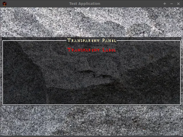
- Fake transparent panel: a JPanel that simulates transparency;
- Fake transparent label: a JLabel that simulates transparency;
- Table header render: a table cell render just for rendering the headers;
- Table cell render: a table cell render that handles the color and format of each cell;
- Table model: a table model to hold the Runeword recipe;
Transparency
At first, I thought that setting the property opaque to false would turn a JPanel into a transparent panel, well, it’s not always true. A small but annoying glitch happens when the panel is over another panel that is transparent too and some shadows appear around components like labels and checkboxes when in focus or its state changes.
To fix that problem I used a base panel with a background image and every time I had a need for a “transparent” component over it, I just used the paintComponent method to copy and paste the area from the background image to the background of the component making it “transparent”, as I’ll show next.
Textured JPanel
This is a simple component that paints a picture as a background. I used this panel as a container for other elements.
public class TexturedJPanel extends JPanel {
    private Image bg;

    public TexturedJPanel(String bgPath) {
        try {
            bg = ImageIO.read(new File(bgPath));
        } catch (Exception ex) {

        }
    }

    public TexturedJPanel(Image bg) {
        this.bg = bg;
    }

    @Override
    protected void paintComponent(Graphics g) {
        if(bg == null) return;
        g.drawImage(bg, 0,0, this);
    }
}
Transparent JPanel
This is a simple custom component that extends its functionalities from the JPanel component except for the paintComponent method which simulates the transparency effect.
public class FakeTransparentPanel extends JPanel {

    private final ResourceLoaderComponent resourceLoader = ResourceLoaderComponent.getInstance();

    @Override
    protected void paintComponent(Graphics g) {
        var g2 = (Graphics2D)g;
        g2.setRenderingHint(RenderingHints.KEY_ANTIALIASING, RenderingHints.VALUE_ANTIALIAS_ON);

        // drawing the background
        g2.drawImage(
                resourceLoader.defaultBackgroundTexture,
                0,
                0,
                getWidth(),
                getHeight(),
                getX(),
                getY(),
                getX() + getWidth(),
                getY() + getHeight(),
                this);

        // filling alpha rectangle
        g2.setColor(resourceLoader.colorShadow);
        g2.fillRect(0, 0, getWidth(), getHeight());
    }
}
The method paintComponent copy a rectangle of the same size as the component from the image, used as the background of the container panel, and paste as the background image of the checkbox component that is being drawn. Then, another rectangle filled with a translucid black color (alpha channel less than 1) is printed over the component bringing some darkness effect.
In this particular case, getX(), getY(), getX() + getWidth() and getY() + getHeight() are the dimensions for the source image and 0, 0, getWidth() and getHeight() are the dimensions for the component itself. This is kind of confusing because the source comes after the destination and may trick you somehow.

Themed JLabel
This component has the same construction as the previous one but also prints the label text.
public class FakeTransparentLabel extends JComponent {
    private final ResourceLoaderComponent resourceLoader = ResourceLoaderComponent.getInstance();

    //text label
    private String label;

    private final FontMetrics fontMetrics;

    private double labelLength;

    public FakeTransparentLabel() {
        super();
        fontMetrics = getFontMetrics(resourceLoader.defaultFont);
    }

    public String getLabel() {
        return label;
    }

    public void setLabel(String label) {
        this.label = label;
        if (this.label != null && !this.label.isEmpty()) {
            var c = new Canvas();
            var lm = fontMetrics.getStringBounds(label, c.getGraphics());
            labelLength = lm.getWidth();
            setPreferredSize(new Dimension((int) lm.getWidth(), fontMetrics.getHeight()));
        }
    }

    @Override
    protected void paintComponent(Graphics g) {
        var g2 = (Graphics2D)g;
        g2.setRenderingHint(RenderingHints.KEY_ANTIALIASING, RenderingHints.VALUE_ANTIALIAS_ON);
        g2.drawImage(
                resourceLoader.defaultBackgroundTexture,
                0,
                0,
                getWidth(),
                getHeight(),
                getX(),
                getY(),
                getX() + getWidth(),
                getY() + getHeight(),
                this);
        g2.setColor(resourceLoader.colorShadow);
        g2.fillRect(0, 0, getWidth(), getHeight());

        g.setColor(getForeground());
        g2.setFont(resourceLoader.defaultFont);
        g2.drawString(label, getWidth() / 2 - (int)labelLength / 2, getHeight() / 2 + fontMetrics.getHeight() / 4);
    }
}
Note that the method setLabel sets the text but also sets some metrics for drawing the text.
The method paintComponent is almost the same as the previous component except that it prints the string calling g2.drawString.
Themed JCheckbox
I would say that after the fonts, colors and buttons, the checkbox is the most iconic interface item.
In order to make a checkbox component with the same characteristics I used gimp to copy the images that represent the checked and unchecked states and then created an empty class called MyCheckbox and extended it from the JComponent. This class is almost a mixture of the other two classes with an extra print for the image of the checkbox according to its checked/not checked state.
//width of the image
private final int SPRITE_W = 22;

//height of the image
private final int SPRITE_H = 21;

//little gap between the image and text
private final int LABEL_GAP = 5;

//the text label
private String label;

//whether is checked or not
private boolean selected;
This class is very common except for the following methods:
public void setLabel(String label) {
    this.label = label;
    if (this.label != null && !this.label.isEmpty()) {
        var c = new Canvas();
        var lm = fontMetrics.getStringBounds(label, c.getGraphics());
        setPreferredSize(new Dimension(SPRITE_W + LABEL_GAP + (int) lm.getWidth(), Math.max(SPRITE_H, fontMetrics.getHeight())));
    }
}

@Override
protected void paintComponent(Graphics g) {
    var g2 = (Graphics2D) g;
    g2.setRenderingHint(RenderingHints.KEY_ANTIALIASING, RenderingHints.VALUE_ANTIALIAS_ON);

    g2.drawImage(
            resourceLoader.defaultBackgroundTexture,
            0,
            0,
            getWidth(),
            getHeight(),
            getX(),
            getY(),
            getX() + getWidth(),
            getY() + getHeight(),
            this);

    g2.setColor(resourceLoader.colorShadow);
    g2.fillRect(0, 0, getWidth(), getHeight());

    if (selected) {
        g2.drawImage(resourceLoader.checked, 0, 0, null);
    } else {
        g2.drawImage(resourceLoader.unchecked, 0, 0, null);
    }

    g.setColor(getForeground());
    g2.setFont(resourceLoader.defaultFont);
    g2.drawString(label, minimumDimension.width + LABEL_GAP, getHeight() / 2 + fontMetrics.getHeight() / 4);
}
The method setLabel is used to calculate the final size of the checkbox label/text, using the defined font and paintComponent draw the component on the screen.

The checkbox is glitchy in this example but it shows the transparency effect.
Themed JScrollBar
The scrollbar was divided into two parts. The first one is very simple, it is just a class extending JScrollBar and setting the UI. The second part is the UI itself.
public class MyScrollBar extends JScrollBar {
    public MyScrollBar() {
        setUI(new MyScrollBarUI());
    }

    public MyScrollBar(int orientation) {
        this();
        setOrientation(orientation);
    }
}
The UI is more complex because the component is painted like the others I have shown here.
Here are the two most important pieces of code, a method to paint the thumb, called paintThumb and another to paint the thumb track or bar called paintTrack.
@Override
protected void paintTrack(Graphics g, JComponent c, Rectangle r) {
    Graphics2D g2 = (Graphics2D) g;
    g2.setRenderingHint(RenderingHints.KEY_ANTIALIASING, RenderingHints.VALUE_ANTIALIAS_ON);

    g2.drawImage(
            resourceLoader.defaultBackgroundTexture, //img - the specified image to be drawn. This method does nothing if img is null.
            0,
            BUTTON_SIZE,
            r.width,
            BUTTON_SIZE + r.height,
            r.x,
            r.y,
            r.x + r.width,
            r.y + r.height,            null);

    g2.setColor(resourceLoader.colorShadow);
    g2.fillRect(0, BUTTON_SIZE, r.width, BUTTON_SIZE + r.height);
}

@Override
protected void paintThumb(Graphics g, JComponent c, Rectangle r) {
    Graphics2D g2 = (Graphics2D) g;
    g2.setRenderingHint(RenderingHints.KEY_ANTIALIASING, RenderingHints.VALUE_ANTIALIAS_ON);
    g2.drawImage(resourceLoader.scrollThumb, r.x, r.y, null);
}
This class also implements the scrollbar buttons on a private class. There’s not much to see here except for the paintComponent method. Also, it’s worth mentioning that you should always set the preferred size of a component otherwise it will not be painted.
There is just one image (the arrow pointing up) for the scroll buttons. Note that I applied a transformation to get a vertically flipped image (the arrow pointing down). If this scrollbar is used for horizontal scroll, SwingConstants.EAST and SwingConstants.WEST should be implemented by applying the correct transformation.
Besides that, the method is pretty much the same as the other classes.
Here is the paintComponent method for the scroll buttons.
@Override
protected void paintComponent(Graphics g) {
    Graphics2D g2 = (Graphics2D) g;
    g2.setRenderingHint(RenderingHints.KEY_ANTIALIASING, RenderingHints.VALUE_ANTIALIAS_ON);

    AffineTransform t;
    var image = new BufferedImage(
            resourceLoader.scrollButton.getWidth(null),
            resourceLoader.scrollButton.getHeight(null),
            BufferedImage.TYPE_INT_ARGB);

    var ig = image.createGraphics();

    ig.drawImage(resourceLoader.scrollButton, 0, 0, null);
    ig.dispose();

    switch (orientation) {
        case SwingConstants.SOUTH:
            t = AffineTransform.getScaleInstance(-1, -1);
            t.translate(-image.getWidth(null), -image.getHeight(null));
            image = new AffineTransformOp(t, AffineTransformOp.TYPE_NEAREST_NEIGHBOR).filter(image, null);
            break;
        default:
            break;
    }

    g2.drawImage(
            resourceLoader.defaultBackgroundTexture,
            0,
            0,
            getWidth(),
            getHeight(),
            getX(),
            getY(),
            getX() + getWidth(),
            getY() + getHeight(),
            null);

    g2.setColor(resourceLoader.colorShadow);
    g2.fillRect(0, 0, getWidth(), getHeight());

    g2.drawImage(image, 0, 0, null);
}
Conclusion

Custom theming in Java Swing applications can significantly enhance their visual appeal and user experience. By working an appropriate Look and Feel, and messing around with colors, fonts, background and borders, you can create a unique GUI that aligns with the application’s desired aesthetics.
Get the sources: https://github.com/raffsalvetti/DiabloRuneWordItemFinder
See ya!